CHAPTER 3
Ivy and Meridian: Design Systems
Improving consistency and usability at the system level
Modal Components
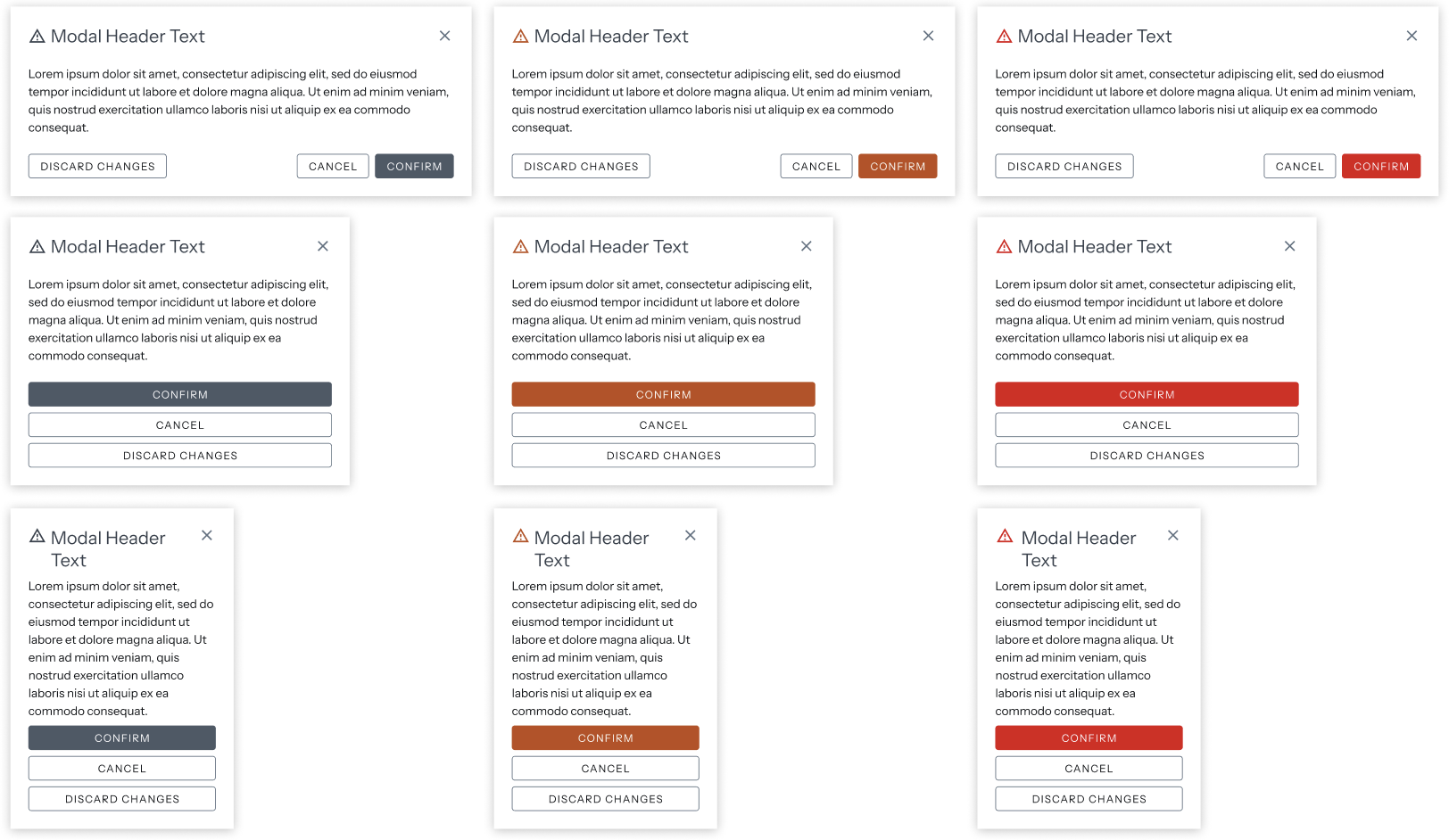
Within the Ivy Design system, the modal components were built to be resuable and adaptable but in certain edge cases, help text expanded too far, pushing the buttons out of view and preventing further user actions.
To combat these usability and visibility issues, I designed a secondary close option: a persistent 'x' close button.
Error States
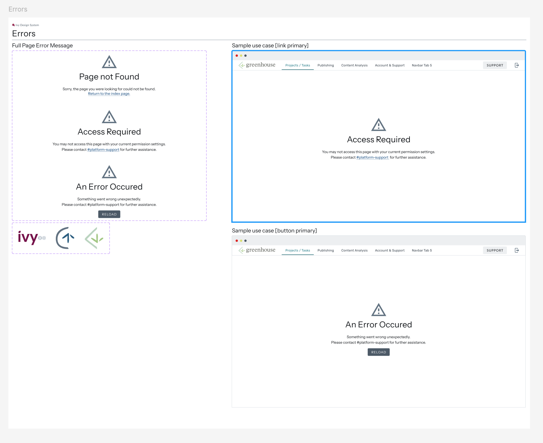
The error page components were initially designed with inconsistent iconography and primary actions, leading to confusion in their usage.
I replaced the ecosystem specific logos with a universal error icon and standardized the actions associated with the error messages. I designed two external error message variants: one with a single primary action link (e.g., to Slack or another page) and another with a primary reload button
Migration and Maintenance
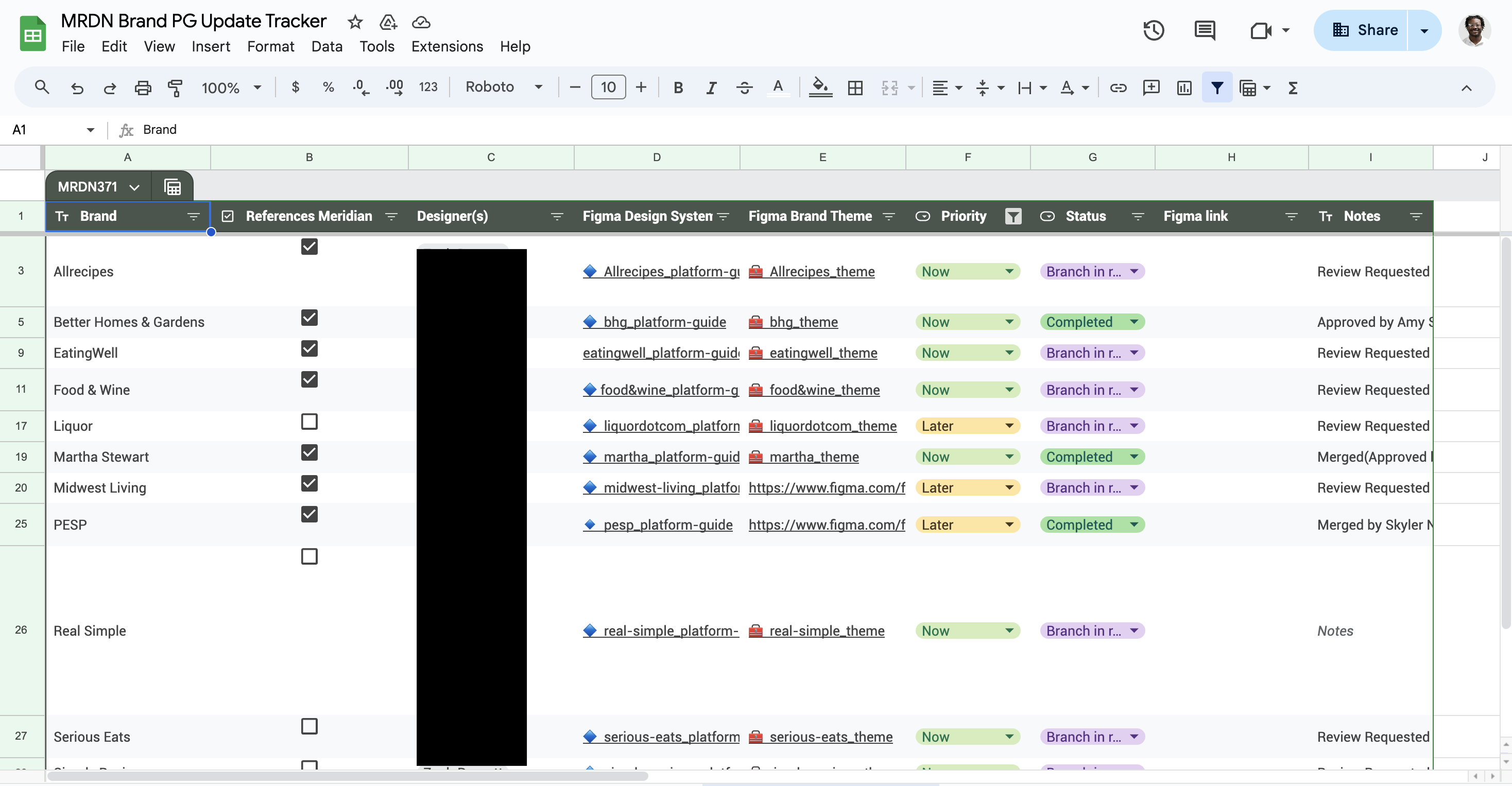
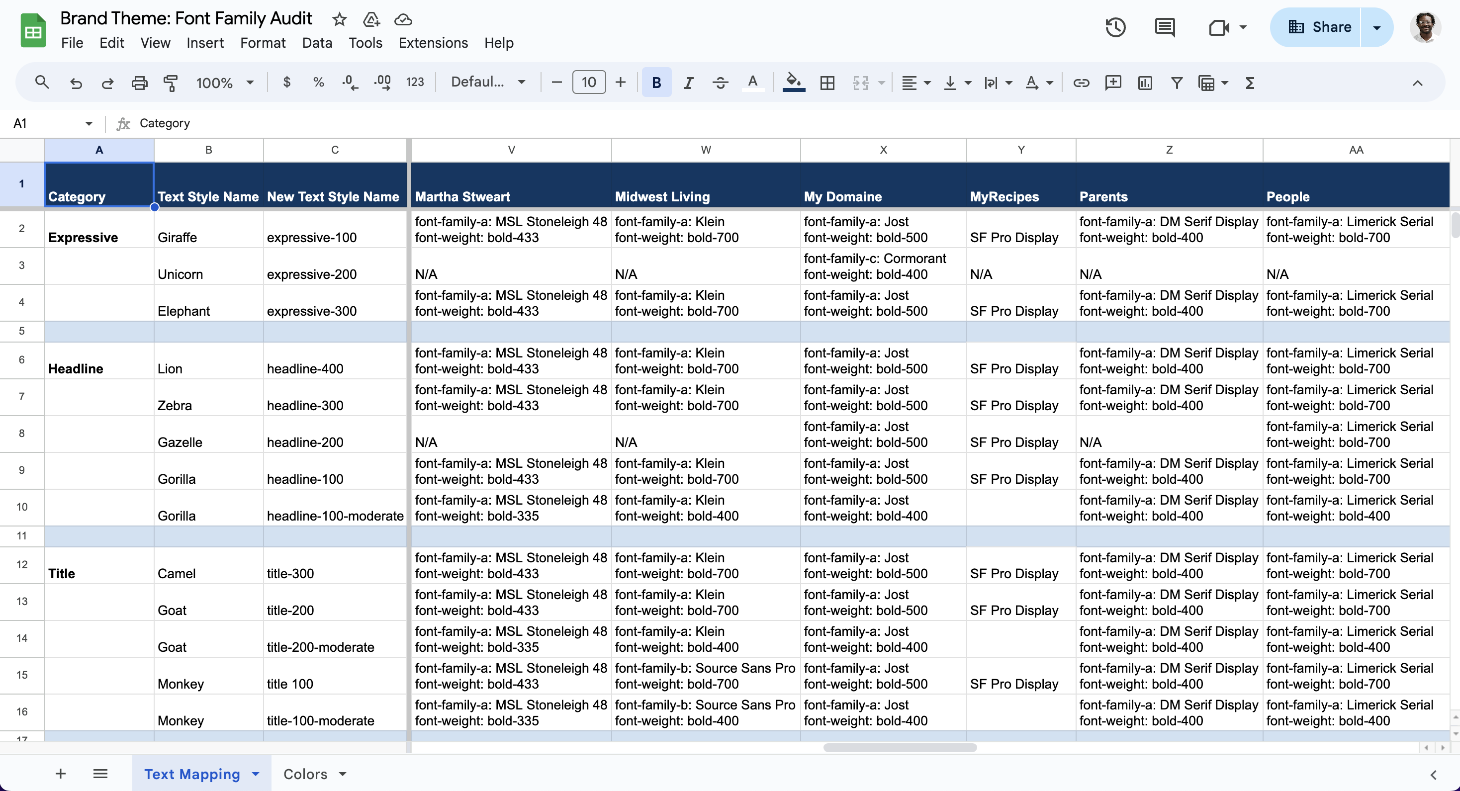
During the Meridian team’s design system migration, large-scale color and typography variables required a comprehensive update. I used structured spreadsheets and trackers to map primitive color and font tokens from legacy naming conventions to a new standardized system. I then created and validated branches of the updated tokens in Figma before merging them into each brand vertical’s platform guides. This approach reduced rollout risk, maintained visual consistency, and enabled teams to adopt the new system in a way that aligned with their individual brand themes.